SoundCloud is a music platform which allows users to upload, promote and share audio. The main reason why, I would say, is the several DJ sets provided by the artists. As electronic music lovers, we attended our thoughts to this great task and generated a totally new design with new features. Our idea was to change the playback experience and the content structure, by focusing on the different „music groups“, for example, playlists from tracks and DJ sets, and generate a consistency in each menu point where they can be found easily. We used diverse methods to analyse the application. It gave us a good understanding of how the app works and we could start generating solid solutions for our aims.
Switching Tabs
and Track Menu
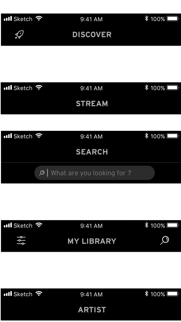
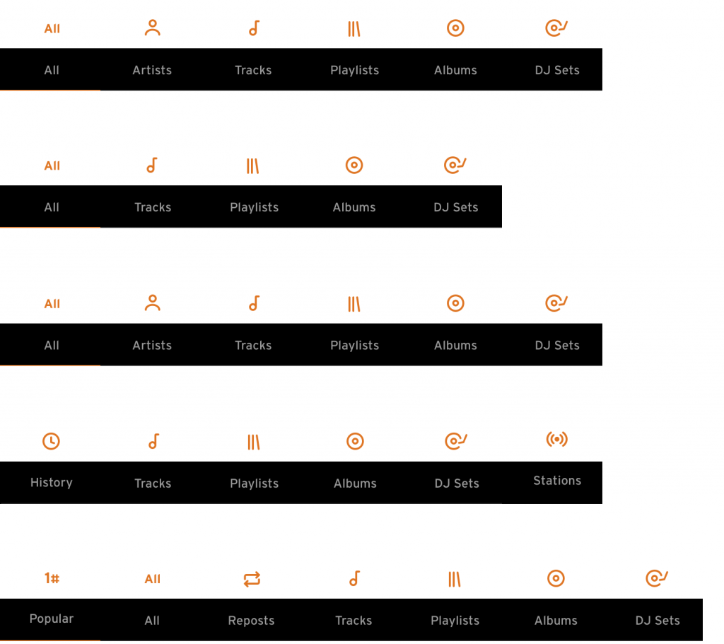
A good way to discover new music is the stream menu item. Here you can see music posted or reposted by people you follow. The more you follow, the bigger the variety. The other way is the „discover“ menu item. An algorithm generates playlists based on the music saved in your in your library or suggests artists you never listened to before on this platform. The category of the music is mixed in both menu items. It is possible that a DJ set gets followed by a song or an album, which is a different kind of music flow. To avoid this kind of scenario we adapt a filter to each menu item. As an example, „stream“ can be categorised in all types, tracks, playlists, albums and DJ sets. The filter concept gives users a better overview and it is easier to find for example DJ sets, instead of searching in music lists for tracks with a realistic set time.
Play Bar
We tried to fuse old school controls with modern ones. Oldschool, because we used buttons to show previous and next songs, like on the old Walkmans or MP3 players. Nowadays it is normal to use gestures for a big range of functions. Over long time usage, we found out that buttons worked better than swiping. Here you can see the play bar.
Search Function
In the actual app, you will find an empty content on the search menu point. It will be generated when you are searching for something. The empty content will be filled with the search history of the user. We also overworked the profile view. Here you can also find the filter concept. Tracks of artists get filtered by popular, albums, repost, DJ sets and playlists. To keep the consistency we masked person with a round frame. Everything else, which is the whole music data is shown in rectangle frames.
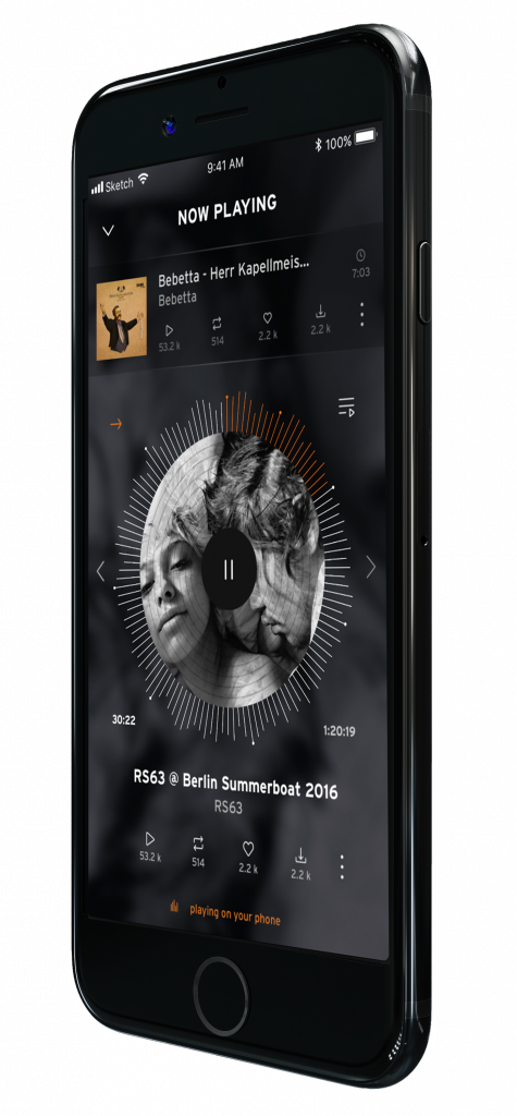
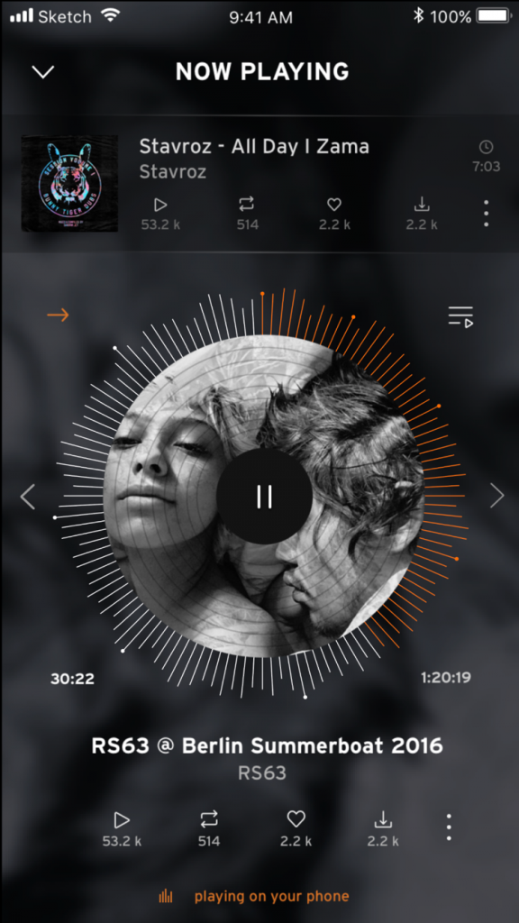
Now Playing Screen
We tried to keep the WAV visualisation of the tracks but instead of showing it from SoundCloud, we stationed it around a circle. The circle pictures a vinyl record, which indicates the possibility to wind while turning the jog wheel. The round marks on top of the WAV visualisation are pointing a segue of a DJ set. On each point starts a new song, you get an audio and visual feedback displayed at the same time, making navigation through a set much easier. The actual track which is playing in a set will also be shown above the vinyl. The idea is to use the function of Shazam. While an artist is uploading his set, Shazam could simultaneously search for the track id and link it to their existing tracks on SoundCloud. Another big change will be the options menu. In our concept, it will be not blended over the screen as it is on the actual SoundCloud app, but integrated instead, as it is shown on switching tabs and filters.
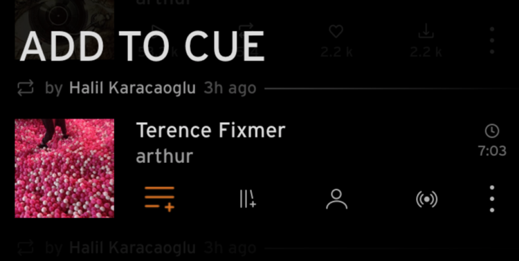
Songs & Sets
Songs and DJ sets will beshown the same way. The main difference would be the time. Trough the filter option the various can be separated. The Track information will be shown by the uploaded picture and stats, found underneath the Name and the Artist. All stats are buttons to give you a more efficient handling. If more options are required, more button can be pressed.
Track Options
The shown stats will be over blended by the additional ones. By dragging them horizontally, they increase in size in one area and the information of the icon above is shown.
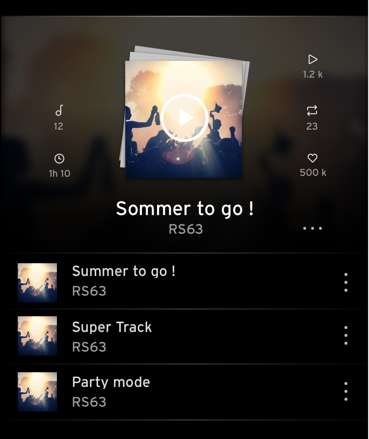
Album View
Playlists and Albums are shown as a stack of vinyl covers. As background, you have the same cover but blurred. On the right side, the options which are also the stats. The songs below are the first three of the album. If you click the name, you will get to the whole track list.
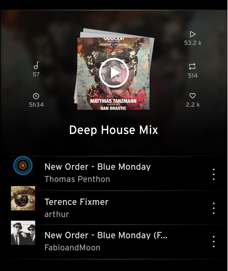
Playlist View
Playlist view is pretty much the same as the album view. Both elements are a bundle of songs, so in order to maintain consistency, they have been given the same design. The only difference will be seen on the tracks underneath the cover.
Stream Content
The stream content is almost the same as „discover“. The only difference is a little detail above the elements. It displays the person who posted or reposted the music and shows the time of the action.
Now Playing Screen
Artists View
Here, the artist is shown in the content. The pictures are framed by a round circle. On the right, the stats are shown. On the top are the followers, in the middle following and below, the value of tracks they posted. By pressing play, the most popular songs will play chronologically. An animation on the right side shows you where the song is playing.
Artist's Profile
This is the artist’s profile screen. The picture elements are shown in the same way as in the listings. The follow button is call to action. Tracks underneath are filtered by the system.
Header
Each tab has its own header. The headers differ depending on the content, additional buttons like a search or settings are provided matching to the content below.
Footer - Tab Bar
Selected tab is highlighted in the primary colour to visualise which tab is active.
Filters
Depending on the active tab matching filters will be provided. As soon as a filter gets activated an icon in primary colour replaces the text. This is a playful way of mixing two different elements together. It is able to show both but not as the same time to avoid overcrowded design.